New in Portfolio: The Dessert Room
Ivonne Karamoy

For most of 2015, I worked with talented pastry chef and owner of The Dessert Room, Marcia Fattouh, on a rebrand. This has been one of those projects that is a perfect fit. With even bigger plans for 2016, The Dessert Room is sure to grow and continue to create elegant and beautiful dessert creations.
The previous The Dessert Room logo helped to get the business started. In the last year, however, Marcia began to forge a clearer vision of where she wanted to take the business and the logo was no longer reflective of the product they produced. It was also limiting from a branding perspective as it posed some spacing and sizing issues when applied to different media.
So we began by going back to the drawing board with a branding questionnaire and discovery session. The questionnaire allowed Marcia to think about her brand holistically, starting with her products and the things she values in her work and business. It was through this process that she revealed her modern aesthetic combined with her focus on detail and classic techniques. Having trained as a French pastry chef, high quality ingredients and techniques are crucial to her work. This is what The Dessert Room is all about. Now to make sure that was communicated through the branding.
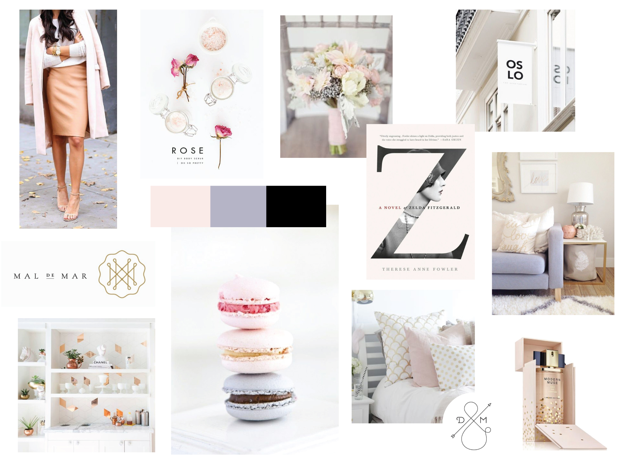
To start visualizing the brand, I distilled some the ideas that came out of our discovery sessions into a visual moodboard. This is a wonderful way to get the ideas and visuals flowing and helps clients begin to understand how their thoughts, ideas and values can be reflected visually.
Next we approached the logo design allowing for the rest of the identity to flow from it. Often during the sketching phase I uncover concepts and ideas that help to inform the rest of the brand identity. To start, numerous sketches were produced, and with Marcia being new to the branding and design process, we reviewed these raw sketches. This is not always something I do with clients. It can be easy to focus on the sketches or any particular sketch and then the project ends before it even begins. But this can be really valuable in helping a client get more involved and comfortable with the process.
The sketches uncovered some ideas that we narrowed down to a few directions for the brand. One was a clear standout for it's classic simplicity and strong concept. Very little changed from the original concept to the final logo.

Reflecting the modern simplicity mixed with classically developed cakes and confections that The Dessert Room produces, the logo was designed with a simple modern typeface stacked and sandwiched between two curved lines that is an ode to the classic and traditional technique of piping.
From there, a color palette was chosen. We looked to color books and ideas on how to use color as it relates to food, ensuring it appealed both to the eyes and to our innate taste and smell sensors. A soft, sweet and warm color palette was chosen with blush and gold being primary colors, supported by white, soft grey and black. Logos need to work in black, but this particular inclusion adds a modern touch that is less traditionally romantic but is classic and timeless.
Within the wedding industry, much like fashion, tastes change and grow with time. So it's important to allow the brand to grow with it and color is an excellent way to do that. A blush and gold combination may work one season, in another black and gold or black and blush appeals to styles better. Using color in this way but ensuring their classic timelessness helps to create a brand that can grow and last.

Selecting typefaces for the brand was a natural extension of the logo and color palette. Using the same Futura typeface in the logo paired with Kepler, a contrasting serif, completed an identity that marries the modern with classic timelessness.

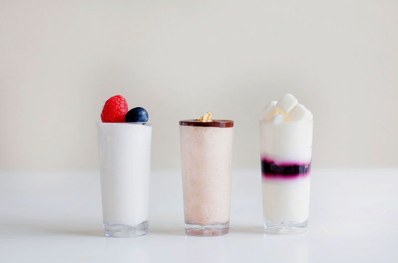
The identity was carried through to the packaging, the website and social media feeds with the support of strong photography. Good product photography makes all the difference! I worked with Marcia to direct and plan the product shots we needed. We worked together with photographer Christine W to style the shoot, making sure all of the products can be beautifully displayed on the website and showcases the delicate and delectable products that comes out of The Dessert Room.